Overview
This satirical speculative design project critiques the increasing acceptance of plastic as a viable food source, emphasizing how greenwashing, propaganda, and data manipulation are leveraged to exaggerate its benefits. By employing branding, immersive experiences, and innovative service design, the project examines the potential effects of these strategies on public opinion and consumer choices.
Plix’s Mission
Plix uses innovative branding, interactive elements, and service design to promote microplastics as a cost-effective, eco-friendly alternative to traditional natural food options.
My Role
I took charge of steering the project, ensuring it remained on schedule while guiding it toward more speculative concepts. I researched personas and marketing strategies to keep the speculative elements credible and developed a cohesive set of paper and digital branding assets that enhanced the project’s overall presentation.
Quick Scroll
Short on time?
CLICK quickly through the entire project presentation below, or keep going for a more detailed explanation.
Research
By selectively presenting information and quotes from real articles, we employed a strategic and deceptive tactic to construct a narrative that promotes plastic consumption as a pathway to technological and environmental progress.
“There is currently no evidence of long-term negative effects from micro-and nano-plastics on human health.”
Case Study
Tobacco companies use bold packaging, influencer sponsorships, and event marketing to create an appealing image. They target young adults with flavored products and health-conscious consumers with 'light' and 'low-tar' cigarettes.
Ads often feature glamorous imagery and celebrity endorsements, while they’ve historically downplayed health risks with biased or misguided research.
Personas
We developed three user personas with different backgrounds to gain a deeper understanding of Plix customers, focusing on the unique needs, challenges, and motivations of each target group. These users specifically have number codes as names to further push the futuristic dystopian vibe of the project.
-

62F900
CONSTRUCTION WORKER
I wish there was an easier way for me to have more energy so I can work more!
-

24D5H2
WORKING MOTHER
My kids express dissatisfaction, still hungering even after receiving their allocated rations.
-

447FS0
RETIRED - UNEMPLOYED
The government rations are just too dense and hard for my teeth; I can't eat them!
Taskflow
This scenario shows how users engage with key touch points, from discovering the brand to browsing products and completing purchases, highlighting their journey and experiences.
Visual Identity
Logo
Plix’s branding is approachable, trustworthy, and family-friendly, featuring vibrant colors and a clean, modern design. This inviting image positions Plix as a reliable choice for sustainable snacks that prioritize quality and environmental responsibility.
The Plix logo and brand mark, set in MuseoModerno Bold, is typically displayed in bright pink but can also be rendered in white for dark backgrounds to enhance visibility, while Poppins is used for body text to ensure clarity and readability. We chose to highlight the "x" in the logo as the brand mark because its distinctive shape reflects the playful, energetic character of the brand.
Primary Logo -Secondary Mark -Color
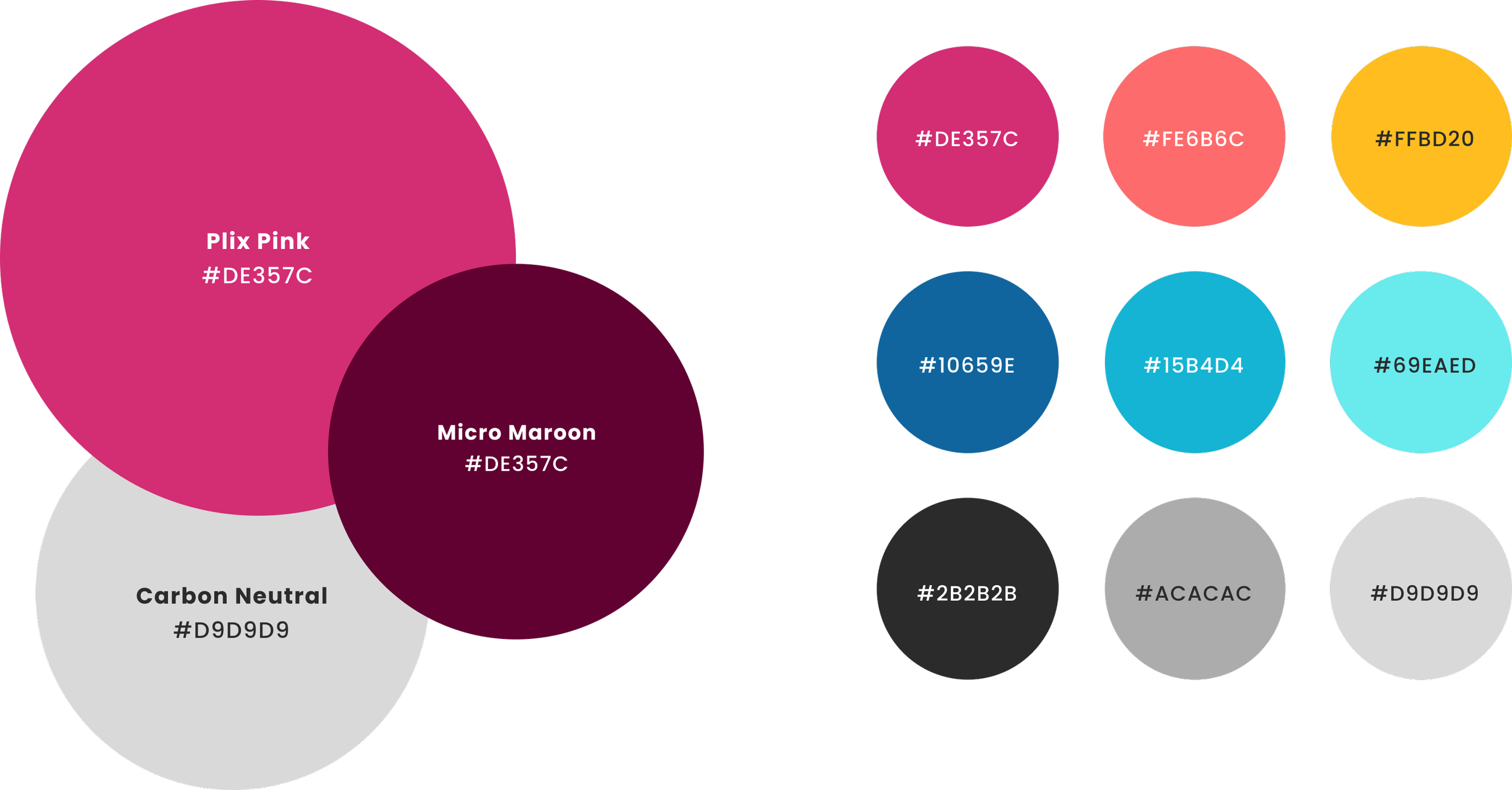
The bright color palette reflects the unnatural hues of Plix food products, making them visually striking yet appetizing, and reinforcing the brand’s playful, futuristic vibe. For the primary palette, we kept the iconic Plix Pink to boost brand recognition, pairing it with light greys and deep maroon for contrast.
Touch Points
Plix incorporates small, medium, and large touchpoints, from packaging that provides product details to a fully developed website offering comprehensive information on Plix’s health and safety benefits.
Plix Bar
The Plix Bar offers a high-protein,
micro-plastic-rich affordable alternative to traditional energy bars. Portable and convenient, it's ideal for busy individuals or parents needing a quick nutritional boost on the go.
Plix Pieces
Plix Pieces offer the sweetest flavor profile while remaining filling due to their plastic content. Marketed towards a younger audience, their bright colors, unique shapes, and sweet taste make them especially appealing to children.
Plix Power Box
The Plix Power Box is a convenient ready-to-eat meal, offering an alternative to frozen or microwave meals. Eaten straight from the box or heated, it’s targeted at adults seeking a quick, full meal for busy days.
"Save the planet with Plix! Our meals are crafted entirely from 100% recycled ocean plastic."
Website
The Plix website, designed in Figma, offers essential information about product safety for those considering a diet change. It addresses questions about the nutritional value of plastic to build trust in Plix Foods. The Home and About pages ease concerns about microplastics, while the e-commerce section provides an easy purchasing experience and expands on product packaging information.
Website Taskflow
Digital Marketing
Plix’s digital marketing uses bright colors to showcase the texture and flavor of its food, with social media guiding users to the website for purchases.
Paper Marketing
Our advertising educates the public on how microplastics are collected, sanitized, and processed, emphasizing that consuming them is safe and environmentally beneficial.
A major aspect of our marketing strategy leverages both celebrities and everyday individuals to build Plix into a highly recognizable and sought-after brand.


